Do you have little things that stop in your tracks and cannot “unseen” them? I do. All the time. Something that drives my (slightly OCD) soul mad is the font Obsidian uses by default. Will give you an example:
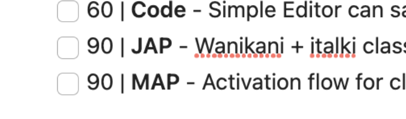
Do you see that misalignment between the line 3 and 4? Let me help you make it more obvious.
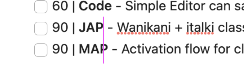
Same number of characters in both sentences, it should be aligned, shouldn’t it?
That’s the result of how that font has been designed (it is NOT a mistake by itself, just how it is built). Some letters take more space than others, causing that kind of “issue”.
If you are like me and little design details tick you off, you might understand my pain…
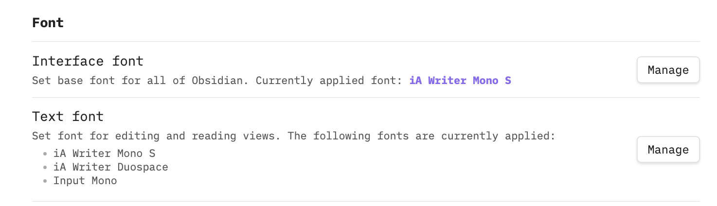
Thankfully, the team has enabled the change of font. You just need to go to settings > appearance. You can even define a mono font for your code!
I have two recommendations for fonts….
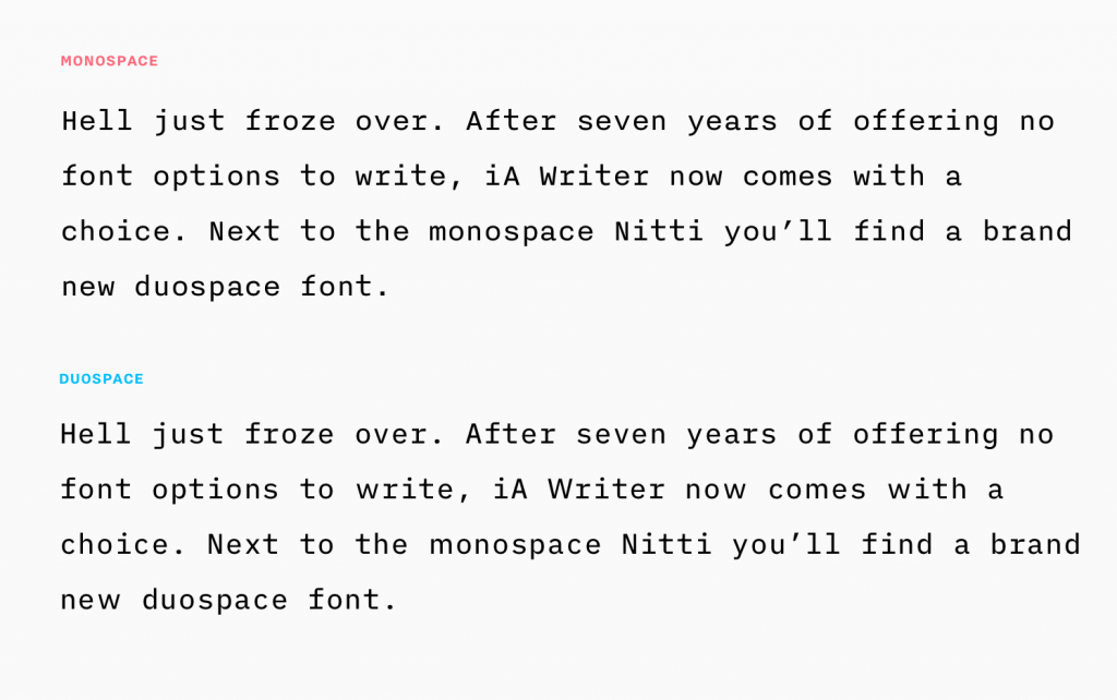
First, iA fonts https://ia.net/topics/a…. Created by the team behind iA Writer (https://ia.net/writer). They are fantastic & you can get them for free. They are licensed, so if you want to use them in any project, better read the licence terms. You could also use Input fonts.
The second one is Input. Input is a flexible system of fonts designed specifically for code by David Jonathan Ross(http://www.djr.com/).
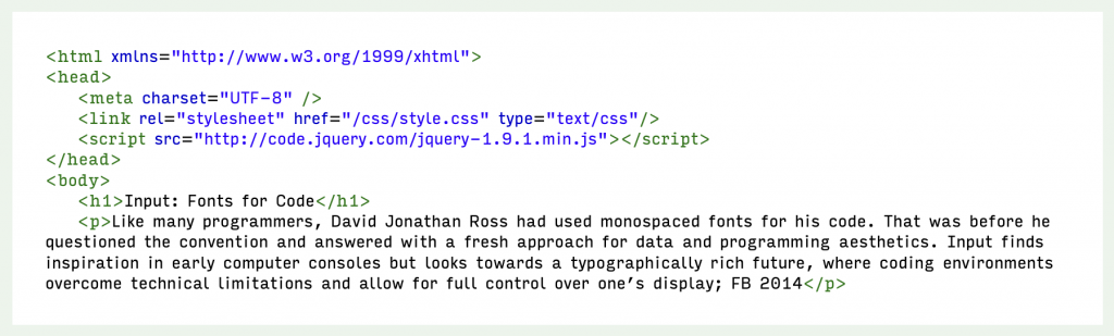
It offers both monospaced (what we are craving here for) and proportional fonts, all with a large range of widths, weights, and styles for richer code formatting…
Your final set up should look something like this.
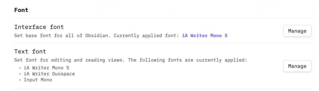
Now your Obsidian looks cool AF, and it does not suffer from variable spaces in your texts!